Context
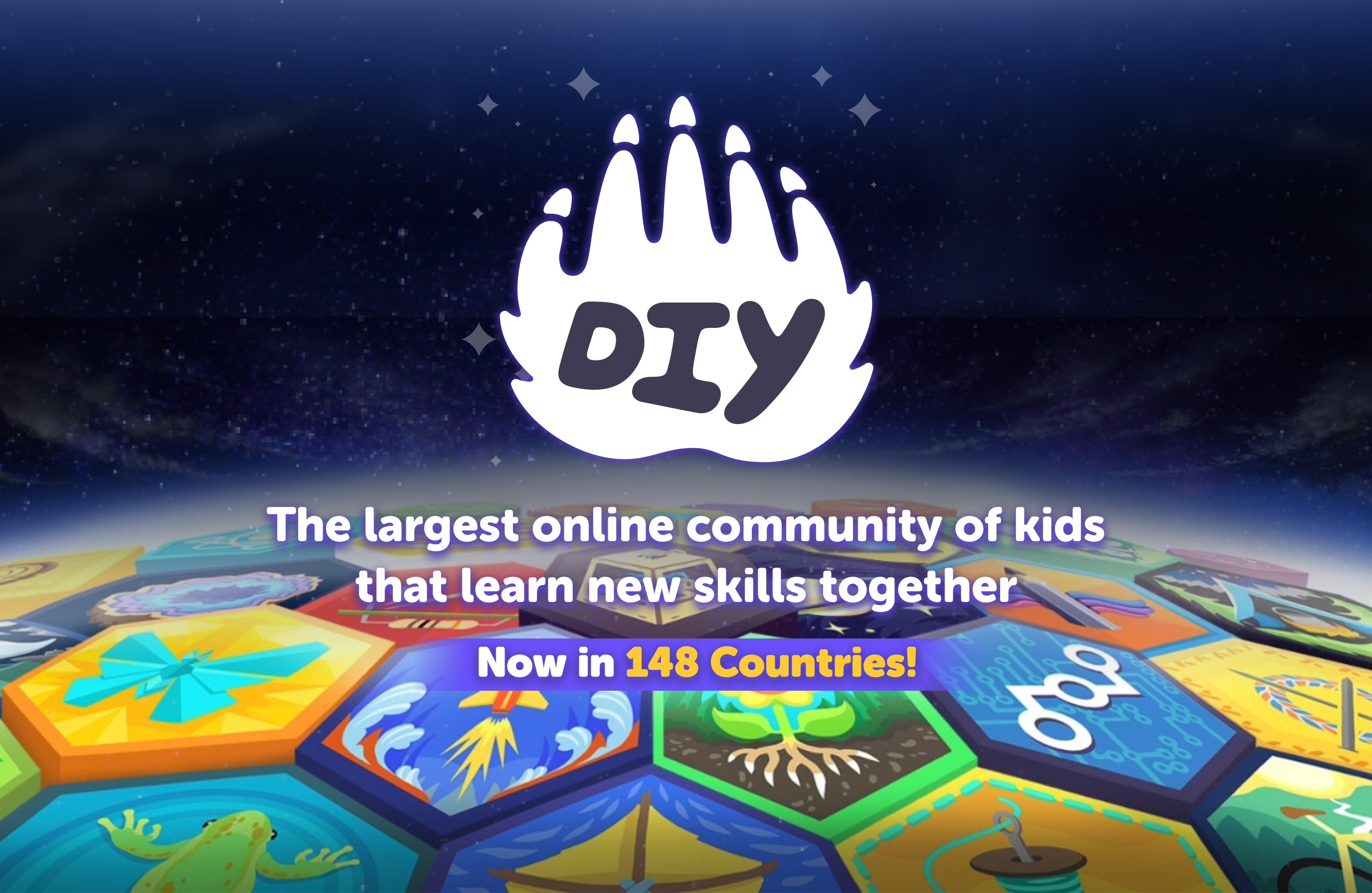
DiY.org is an interactive learning platform for children that offers creative courses, challenges, and a global kid-safe community. While the platform had strong educational content, the user experience felt static and lacked a sense of playfulness or reward that aligned with its young, creative audience.
Overview
User feedback and analytics showed a drop-off in engagement after key milestones—such as completing challenges or moving between learning modules—suggesting an opportunity to improve emotional connection and user satisfaction.
The DiY product team identified motion design as a potential solution to enrich user flow and create delightful micro-moments across the app.
Task
The design team was tasked with creating a set of motion-based interactions to enhance key user moments, including:
- Splash Screens: Making the app opening feel magical and on-brand
- Success Screens: Celebrating user achievements with fun, reward-driven animation
- Loading Screens: Smoother transitions between challenges, modules, and interactive tasks
- Onboarding Screen:
Action
To achieve these goals, I took the following steps:
Key goals
- Improve retention and session time by enhancing the user journey
- Increase emotional engagement and reward feedback
- Ensure animations were accessible, age-appropriate, and optimized for performance
Discovery & Research
- Analyzed emotional flow of young users across key app moments
- Reviewed how animation was used in child-focused apps (e.g., Khan Academy Kids, Youtube Kids, Helloaurus, OK PLay, Toca Life World)
- Conducted empathy mapping to pinpoint areas of friction, confusion, or emotional drop-off
Wireframing & Prototyping
- Created low-fidelity wireframes to map the user journey.
- Iterated multiple UI designs based on feedback from Samsung stakeholders.
- Developed an interactive prototype for usability testing
Designing Motion for Delight
Splash Screen
- Created a lively intro animation featuring DiY's logo popping out with tools and ideas swirling around
- Synchronized the animation with loading progress to reduce perceived wait time
- Use of sound to make it more interactive and stimulating.
- Splash screens were created for specific occasions such as Halloween, Christmas, Inktober to engage with user
Onboarding Screens
- Designed a 7-step animated walkthrough using Lottie-based transitions
- Used playful animations to demonstrate app features:
- Designed a 3-step animated walkthrough using Lottie-based transitions
- Added micro-animations like character waves, blinking stars, and icon pops to hold attention
Success Screens
- Developed celebratory animations using confetti, animated badges, and interactive sound
- Mascots performed “happy dances” when kids completed tasks or unlocked new levels
Implementation & Testing
- Built animations using Lottie & After Effects, optimized for web + mobile
- Built animationConducted A/B testing to compare static vs. animated journeyss using Lottie & After Effects, optimized for web + mobile
- Gathered qualitative feedback from kids and parents through playtesting sessions
Results
The motion design overhaul led to significant improvements in both engagement and satisfaction metrics:
- +35% boost in onboarding completion
Animated walkthrough reduced confusion and increased app registration
Kids were more likely to return after completing onboarding
- +40% increase in time spent during challenges and learning modules
Motion helped sustain curiosity and guide flow between screens
- Overall NPS rose by 14 points in the quarter following the launch
Parents noted higher app usage without external prompting
Kids began sharing in-app badges and achievements more frequently
-
DIY.org won Kidscreen Awards 2022 -
Best App for Kids (Original)