Context
This case study focuses on creating a personalized section in app for an important yet neglected category, contrasting it with a generic product landing page. It showcases how a dedicated interface offers a comprehensive and cohesive user experience, enabling faster decision-making.
The redesign and introduction of thecategory specific interface in app resulted in a 3% increase in click-through rates (CTR) and enhanced user engagement.
Overview
Certain critical yet overlooked categories on the platform (e.g., niche products like personalized gifts or custom hampers) were underperforming despite their market potential.
Task
The objective was to design and launch a separate section of personalized gifting for the neglected category to
- Provide a holistic and comprehensive view of the product range.
- Enhance user experience through detailed content, visuals, and contextual CTAs.
- Improve CTR, reduce bounce rates, and increase engagement.
Action
To achieve these goals, I took the following steps:
Research Phase
- Conducted user research to understand pain points regarding the potential of category.
- Analyzed competitors with category-specific interface to identify best practices.
- We realised a major pain-point where user were limited by their imagination, and could not differentiate between personlisation and customisation and missed out on a lot of possibilities.
- Collaborated with the marketing team to define key value propositions for the category interface.
Planning and Ideation
Outlined a wireframe structure to include
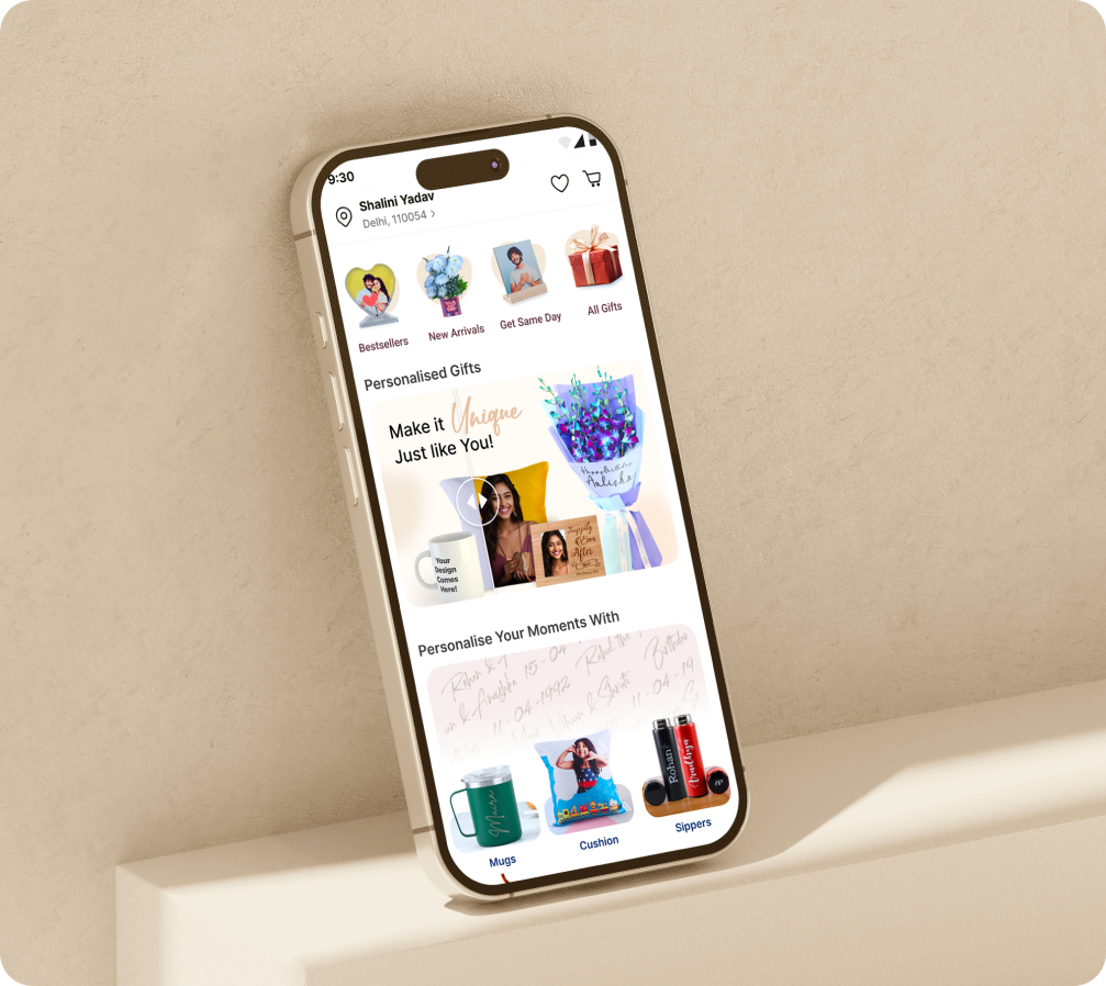
- Hero banner with clear CTAs
- Subcategories and product filters for better navigation.
Design Execution:
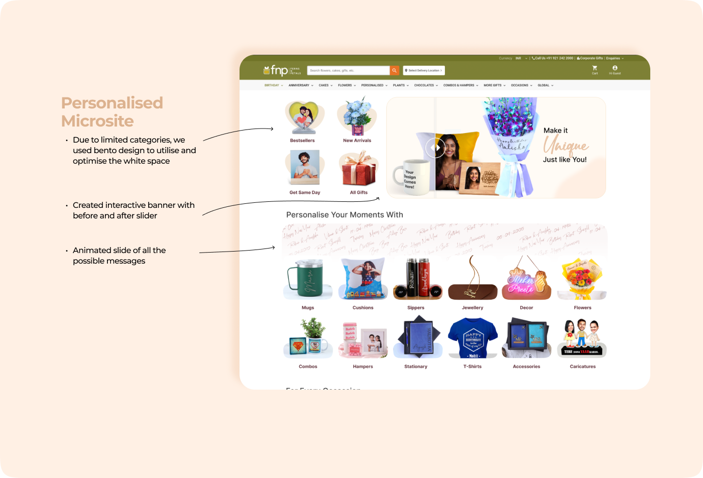
While we were ideating, we realised the limitation user feel as they are not able to utilise the potential of personalisation. Where they can write any message and make it personal the way they want. They usually end up adding names and buy generic products. Hence we created an interactive banner that allowed the user to see before and after of product, an animated slate with all the possible renditions of messaging was also incorporated to help users.
- Developed a modular design system for scalable interface architecture.
- Used high-quality visuals, illustrations and videos to enhance product storytelling.
- Incorporated personalized recommendations using user behavior data.
Design Prototype
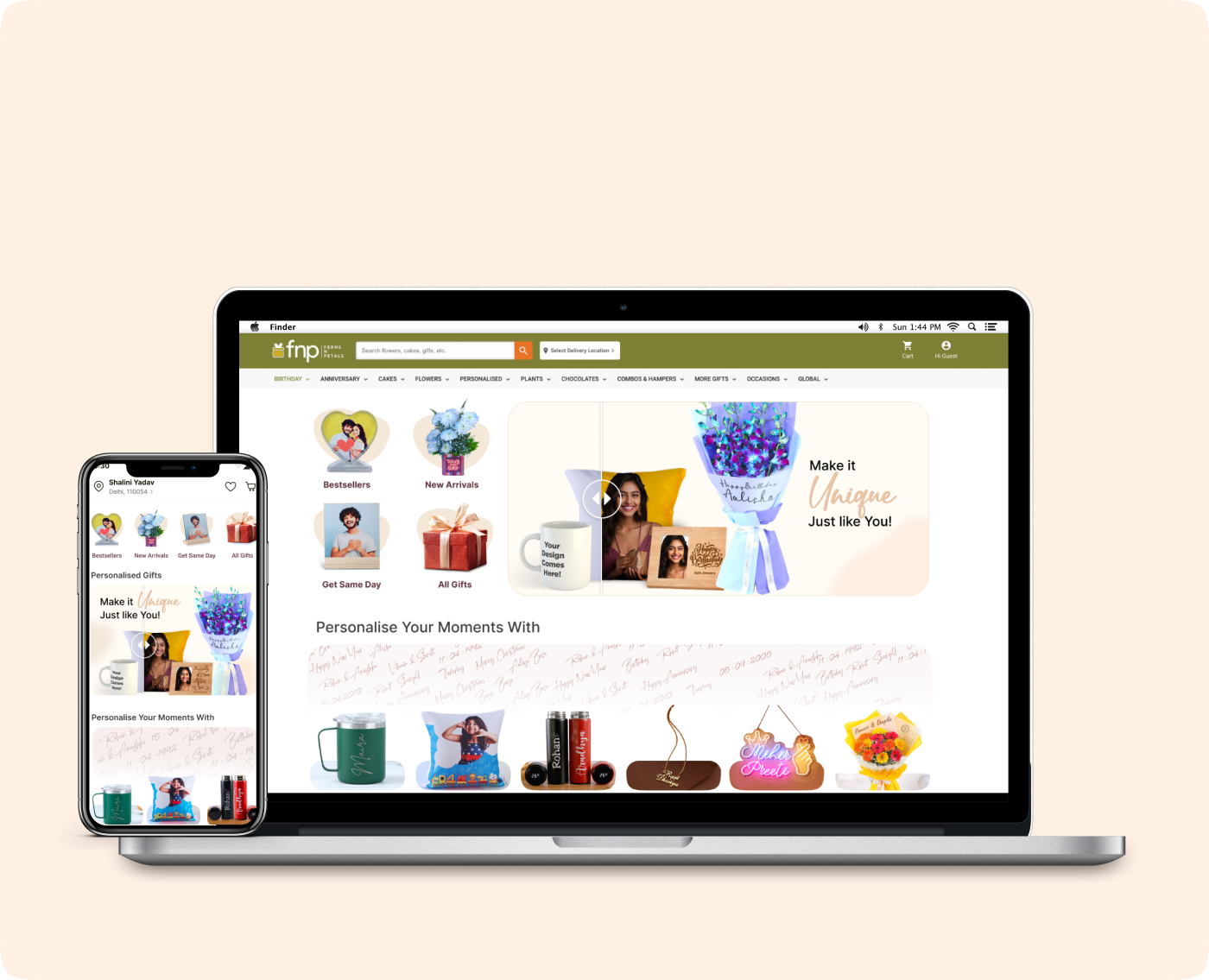
- Since there is a percentage of users that use desktop website to place order, we created a desktop specific interface catering to non frequent users.
- Used high-quality visuals and videos to enhance product storytelling.
Results
The personalized microsite outperformed the generic landing page with the following results
- CTR (Click Through Rate)
New Personalised Microsite Increased by 3%.
- Engagement
Average session duration improved by 40%.